CONTEXT
Desktop web app · Expert user workflows · Digital transformation
ROLE
Lead designer
Navigator: Designing for when things go wrong
Led the design strategy that broke a four-year product stalemate, driving adoption for 7,000 global reservation agents
Built and launched Irregular Operations flows into Navigator, reducing reliance on legacy tools during disruptions
Secured funding for a foundational itinerary card redesign after four years of resistance
Increased Navigator usage 5-25% across agent locations globally
When things went wrong, a delayed flight, a missed connection, a stranded passenger, United Airlines reservation agents didn't use Navigator.
They went back to EZR, a 20-year-old tool that was expensive to maintain and painful to use.
Navigator had been live for years, but when it mattered most, agents didn't trust it.
Over three years, I became the team's institutional memory, providing continuity through multiple leadership changes as the design team grew from two to seven designers.
THE PROBLEM
What stakeholders believed: Navigator needed more features to drive adoption.
What the research revealed
Research consistently surfaced the same pain points. The itinerary card was difficult to scan and slowed agents down during high-pressure scenarios.
The core workflow hadn't evolved. New capabilities were added, but the primary workspace remained unchanged.
Agents created workarounds. During IRROPS, agents abandoned Navigator and returned to EZR.
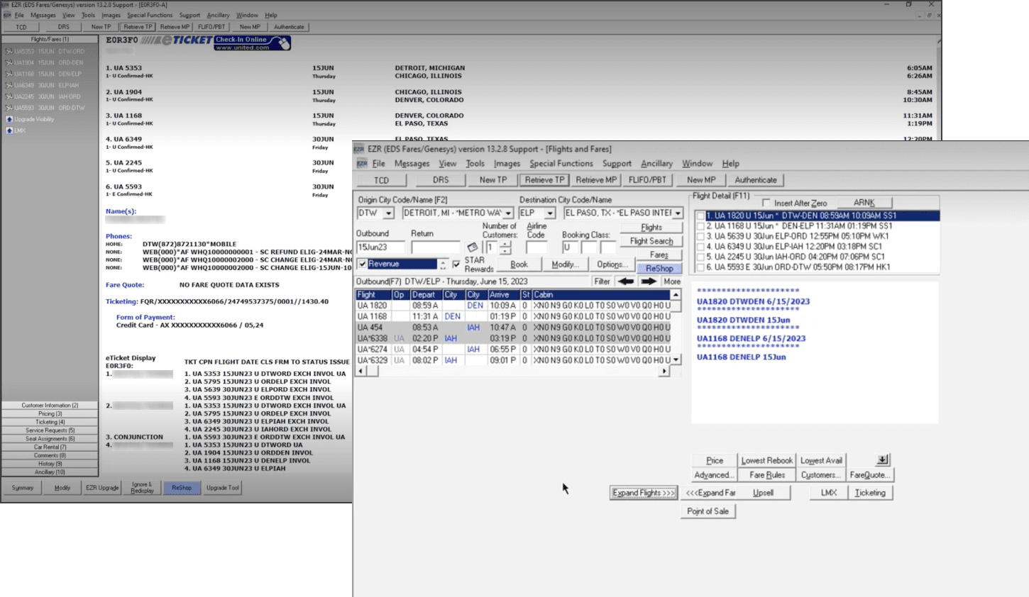
EZR
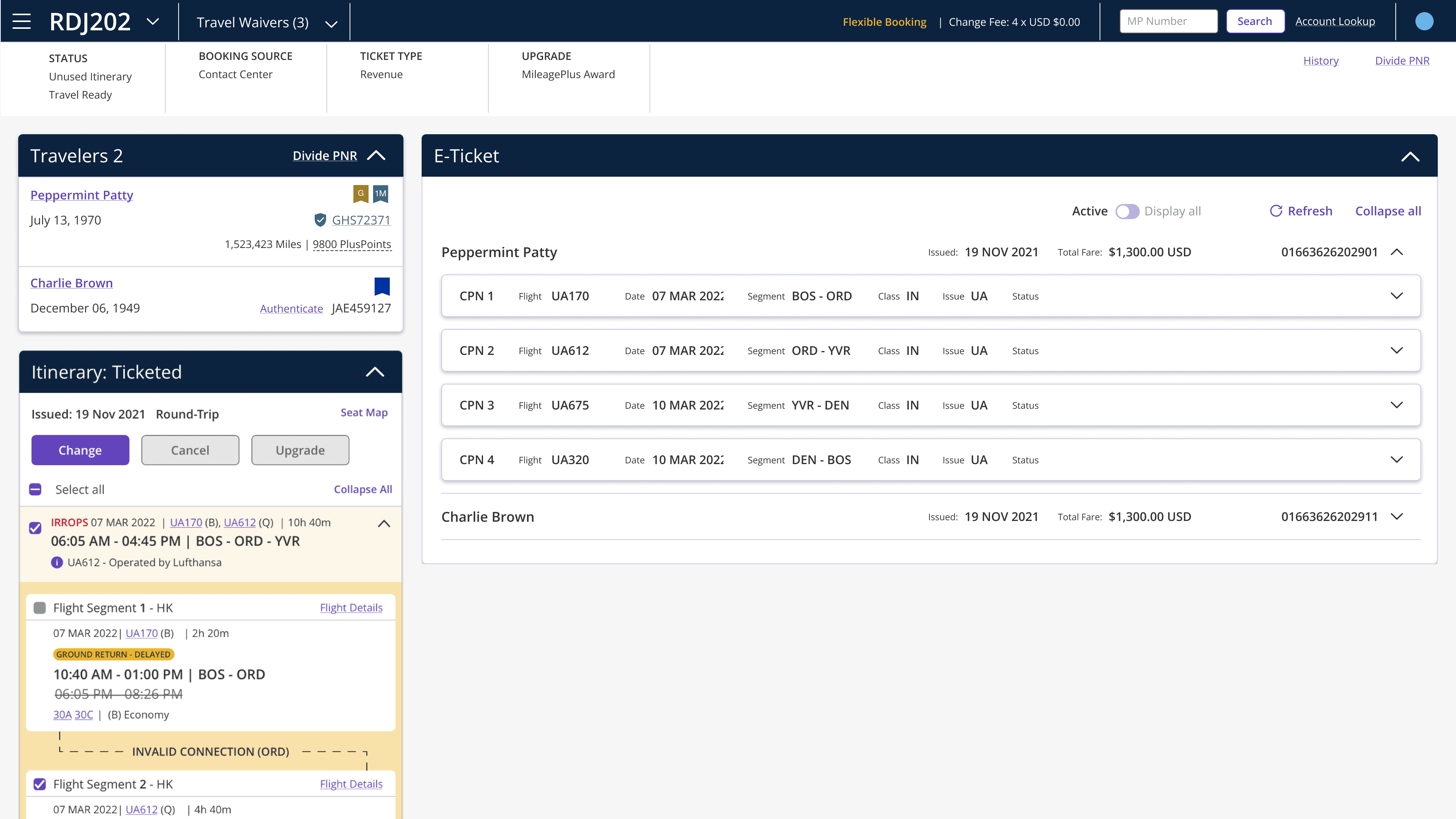
Navigator
When I joined, I dug into prior research and found something buried. The large itinerary card had always been part of the vision. It had been scoped out as an MVP decision and never revisited.
I didn't pitch the itinerary card redesign directly. Stakeholders were focused on feature velocity and I hadn't yet earned the credibility to reframe the entire product strategy.
Instead, I identified IRROPS as the wedge. It was a high priority epic, and was an undeniable, high-stakes gap that I knew would require a larger, more flexible itinerary card to solve properly.
My approach was to build trust with our stakeholders, treat them as valued partners, and let the work make the argument. If I could prove Navigator's ability to handle the worst moments, the case for the larger itinerary redesign would make itself.
THE IRROPS FEATURE
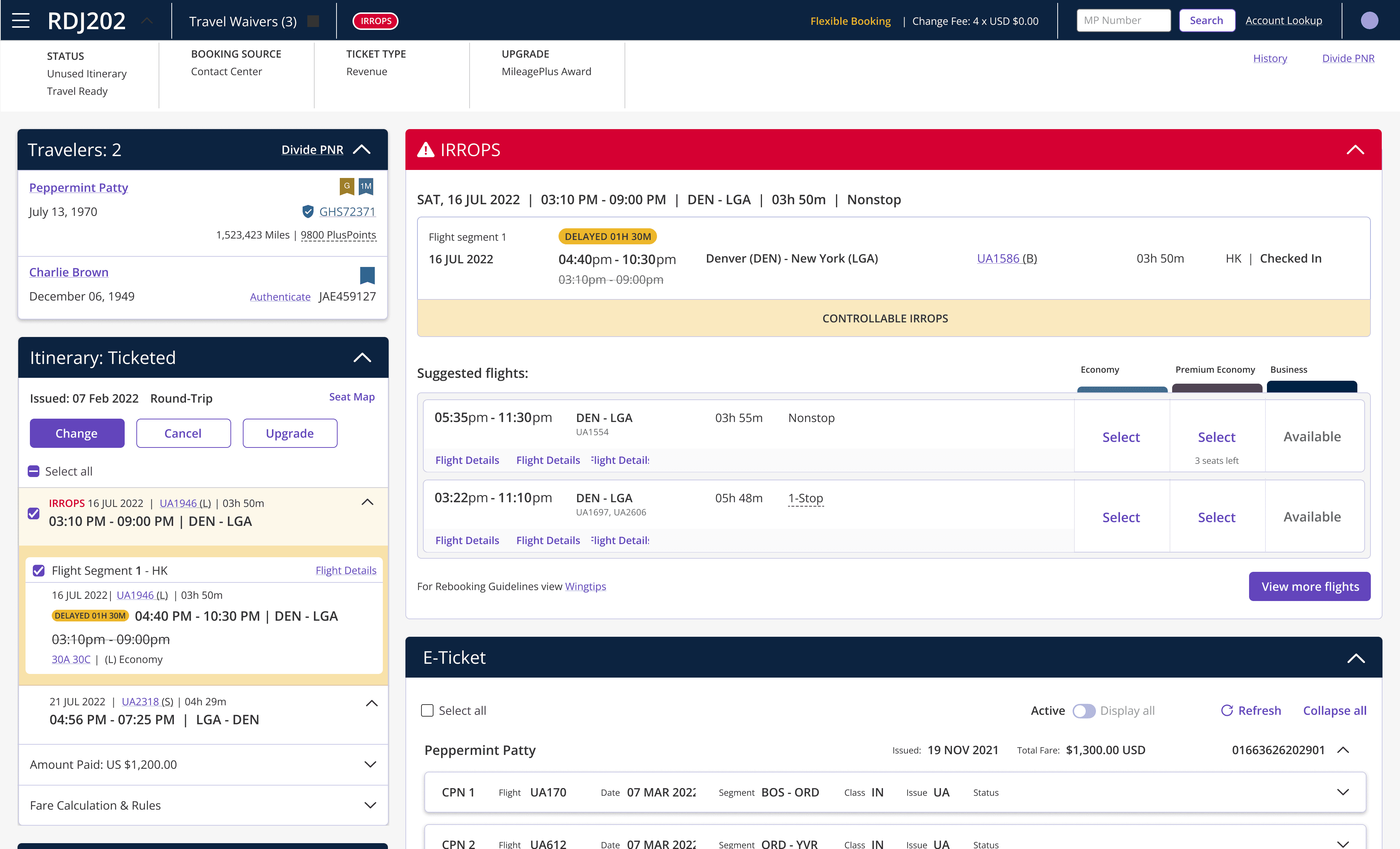
Before this feature, every IRROPS event meant switching back to EZR. I designed for three scenarios: protecting passengers via suggested flights, reshopping at the line of flight level, and reshopping at the segment level.
EZR allowed agents to reshop individual flight segments, Navigator didn't. For tenured agents, that missing flexibility was a dealbreaker.

Key design decisions
A. Show the full picture first.
Flight segments were hidden in an accordion. Showing the full line of flight helped agents assess disruptions before making a rebooking decision.
B. Bypass the search setup.
Suggested flights removed unnecessary rebooking steps, helping agents act faster when every second mattered.
C. Surface the disruption type immediately.
Controllable versus uncontrollable disruptions determined which policies agents could apply. Surfacing that information reduced the risk of
making the wrong offer.
D. Make status visible and dynamic.
Agents needed continuous awareness as disruptions evolved. A persistent status indicator kept critical information visible throughout the workflow.
Following the release, Navigator usage increased 5 to 25% across agent locations globally.
THE UNLOCK
Stakeholders had watched agents navigate complex disruptions without leaving Navigator for the first time. The use case was no longer theoretical.
The large itinerary card, deferred for four years, finally was funded.
It wasn't a hard sell. It didn't need to be.

Content testing: three itinerary variants tested with agents.
Three research principles shaped the redesign.
THE PROOF
And when agents trusted the tool, they stayed in it.

The redesign validated what agents had been telling us all along.
Company-wide agent feedback echoed the same three principles uncovered during research.
These weren't compliments about aesthetics. They confirmed that the underlying design decisions solved the right problems.
WHAT I LEARNED
The hardest problems aren't on the screen.
They're usually buried beneath inherited decisions, organizational constraints, and assumptions that no one is questioning anymore.
This project taught me that design is more than improving the end-to-end user experience. It's about finding the leverage point that changes how decision-makers think about the problem.
I couldn't force the itinerary card redesign when there were bigger priorities. I earned the opportunity by proving I understood the domain, building trust with stakeholders, and using IRROPS to demonstrate why the larger change mattered.
The visible problem wasn't the real problem. Solving the right problem changed the product.